New website for Brouwerij Sterkens
Welcome at the new website of Brouwerij Sterkens!
A few months ago, we designed a new logo for both Brouwerij Sterkens as for Bierparadijs. You could already see this on our official Facebook page. Not only the logo of the brewery was outdated, but the website too was in urgent need for renewal.
After some research to find an appropriate marketing and communication agency, we met ViaVictor, and Antwerp based agency. Together with them, we developed a new web design. We already want to thank ViaVictor for creating this website.
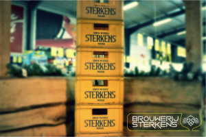
As you can remark, the colour yellow is pretty dominant in this new design. Not a coincidence and a conscious choice. Yellow is reflected in our logo and the colours yellow and black are the official colours of the city of Meer. The colour yellow refers to the colour of beer too. We chose for a tighter and more modern design. Brouwerij Sterkens has a rich history, but we are certainly looking to the future with a lot of confidence and enthousiasm. Our new website helps us building a stronger position in the world of beer. We hope to attract new clients constantly. Brouwerij Sterkens is a medium to big, professional brewery, but we are eager to grow each day.
After a few months of designing, testing and writing, we can present with great pride our new website. Feel free to click on each web page. If you have questions or comments, you can always contact us at info@sterkensbrew.be. Cheers!